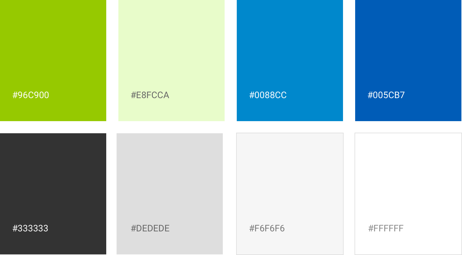
Component Library

Transforming a basic UI kit into Everyday Health's first modular component library and design system

Overview

As Director of Product Design at Everyday Health my mission is to design delightful user experiences across all our platforms and tools that is cohesive and on brand. I successfully achieved this by designing a clean and modern UI system and leading collaboration with all development teams to create Everyday Health's first reusable component library. Since its birth, our component library is used across Everydayhealth.com, making our platform cohesive, consistent and easy to maintain and update globally.

Role

UX & UI Design
Product Design

Project Type

Design System

Launched

2017 - present

The Challenge

Inheriting legacy and so many variations

Before coming into my role as Director of Product Design, Everyday Health had 25+ templates with numerous modules that were kind of similar but different. Variations included image sizes, image ratios, text sizes, border styles and interactions.

Noticing that Everyday Health was consistently inconsistent, I made it my mission to clean up our UI, improve design quality and make our platform useful, credible and accessible. Up until this point, development was completed on a per-template basis by different developers which led to difficulties in quality control and UI discrepancies across multiple templates. I needed to transform design handoffs into a centralized and consistent process.

Taking inventory

Collectively, the design team took inventory of all existing modules and I prioritized module updates based on most common use and projects coming up in our design roadmap. Following this, we regrouped with all tech leads to present our findings and create consensus about the importance of a new component library.

Defining our single source of truth

The first step to create Everyday Health's first component library was getting together with tech leads in a cross-functional effort to discus pros and cons, scoped out level of effort and strategize a phased out approach. Our goal was to create a component library that would:

  1. Create a cohesive user experience across site
  2. Be scalable and accomodate different use cases
  3. Reduce tech debt and increase development time of new features
  4. Reduce manual QA efforts and completion time

Freshenin' up the UI

Taking a mobile-first approach, I designed a simple and clean UI void of unnecessary frills. Without sacrificing quality, I needed to ensure scalability and a seamless execution across multiple templates across our web platform. I made the following updates:

Font-Family: Open Sans

For a pleasant online reading experience, I replaced all fonts with Open Sans, a web font with several font weights ranging from light to extra bold. By eliminating multiple fonts, our pages loaded quickly and our page speed performance improved. Open Sans was perfect for our website because it is optimized for mobile, web and print (our users like to print). For phase 1, I used regular and semibold.


Color palette

I consolidated our color palette and kept essential primary and base colors. No more dark grays, medium grays, light grays, light-light grays, extra-light-light grays. Yay!
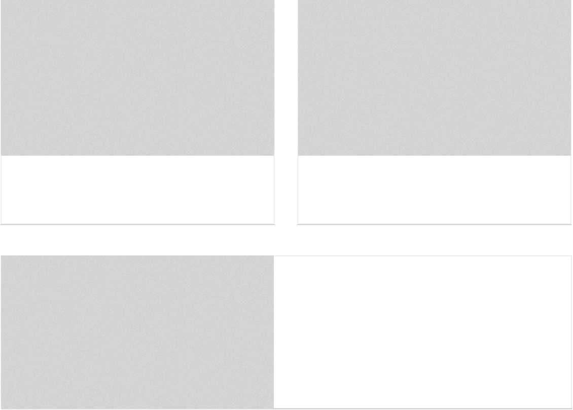
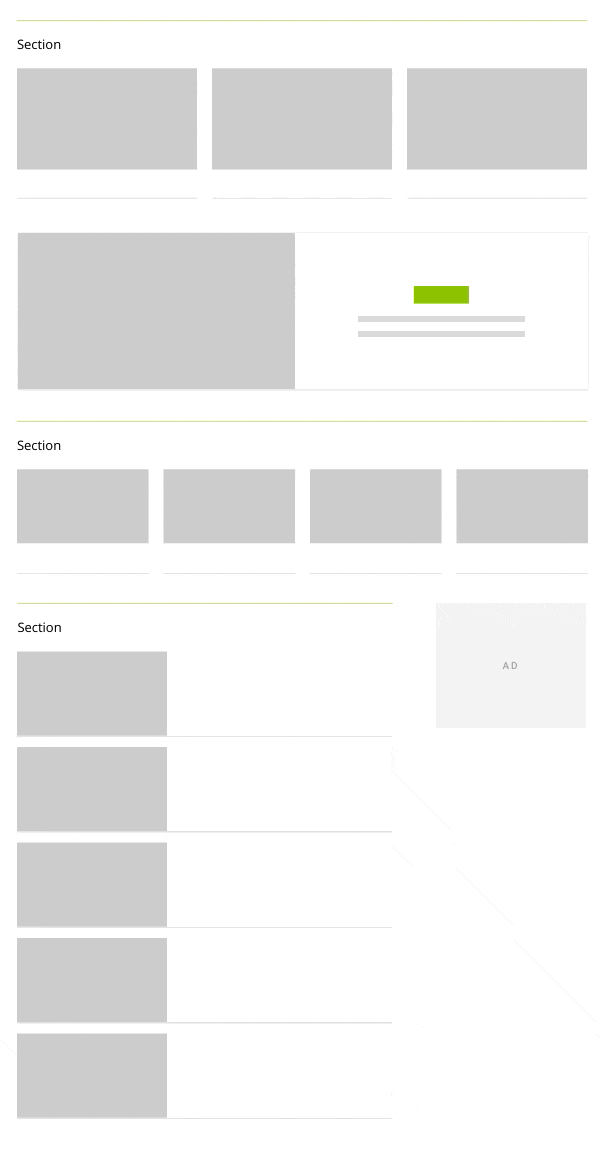


Card UI

In a nod to material design, I kept our UI flat and used cards to display content. This gave my design team flexibility in supporting multiple content types and displaying different icons for articles, slideshows, blogs, quizzes, assessments and videos.

Phase 1: Content cards

As a team, we decided to build our component library in phases and start with our basic content card. Afterwards, we would expand our component library with larger components.

Phase 2: Larger components

After releasing the first round of components, it was time to scale up. I used our existing cards as the building blocks to create a collection of larger components with the flexibility of displaying 3 to 10 cards per component.

Phase 3: Modularity and flexibility

Each component was designed and coded to be modular on mobile and desktop. Components can be separated and recombined with the benefit of flexibility and variety.

Final template rollout

Below are examples of how components were applied to different templates. You can add as many or as few components as necessary to accomodate varying amounts of content.

What I learned

One component does not work for everything and that’s okay. It takes collaboration and daily communication between all designers and developers to set rules around what should become a new component and if an existing component should be updated. This makes documentation in a fast-paced environment crucial for smoother decision-making.

I learned that there's a balance between establishing rules to maintain consistency and simultaneously evolving our visual ecosystem. At Everyday Health we are still using and maintaining our component library and are working towards the next iteration which involves a CMS migration. This requires better documentation, more components and improved cross-functional collaboration. Stay tuned!

Previous

My Daily Symptom Trackers

Next

Hepatitis C Testing Campaign