Hepatitis C Testing Campaign

Raising awareness of Hepatitis C's prevalence and connecting at-risk people directly with labs and specialists for free testing

Background

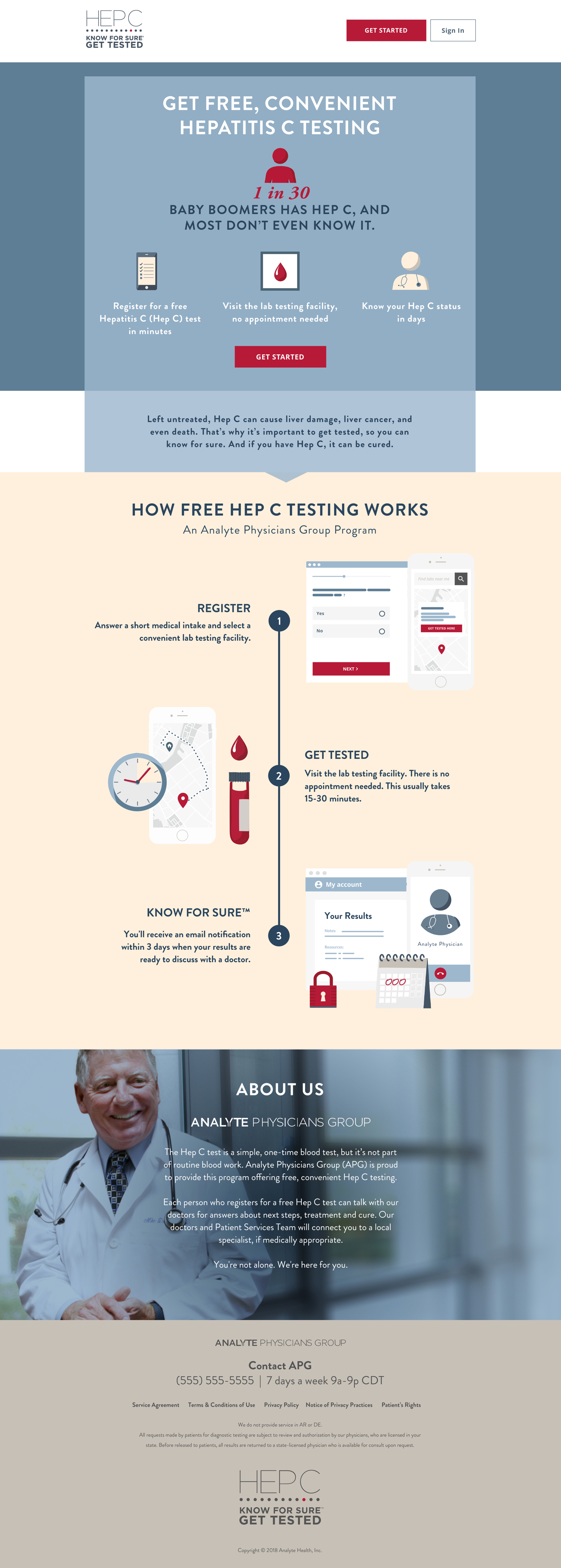
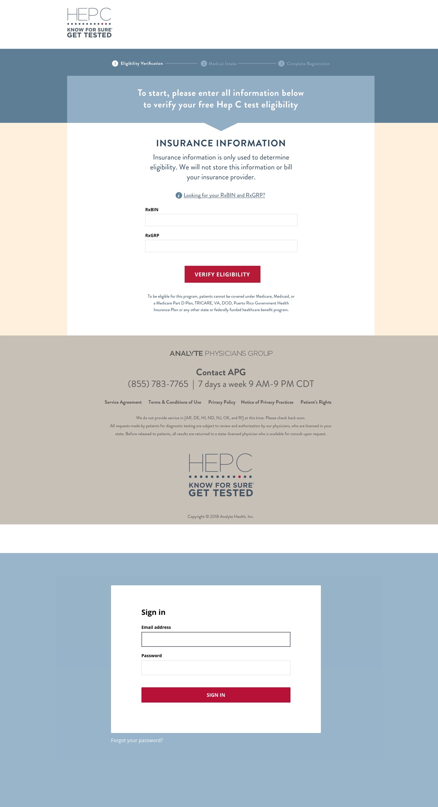
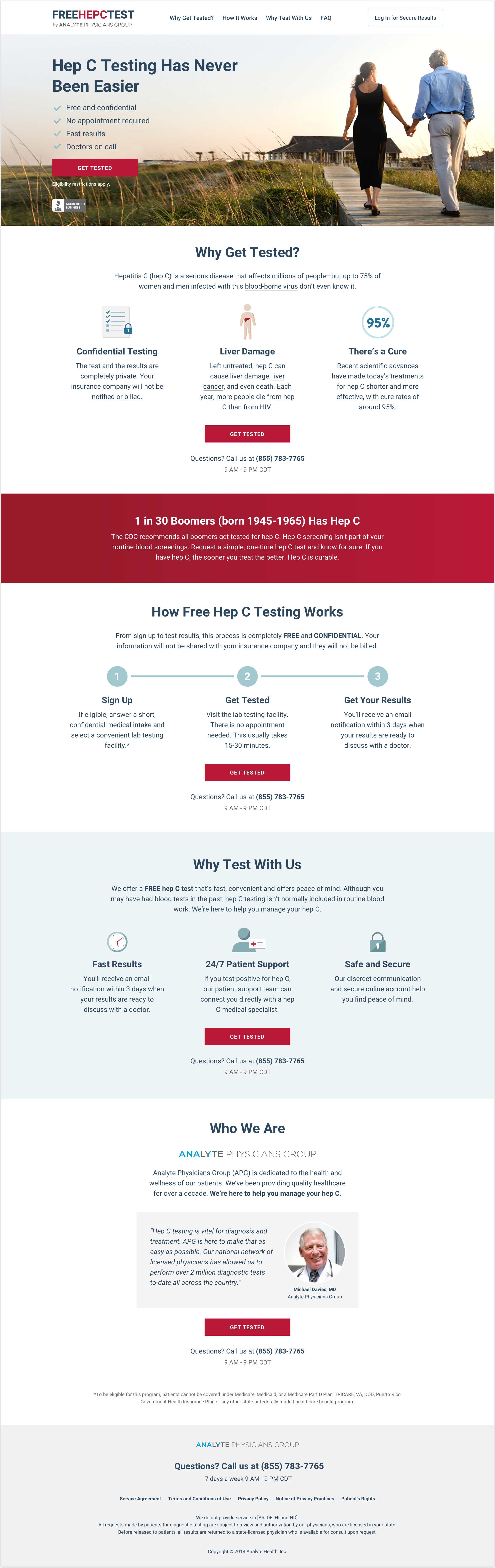
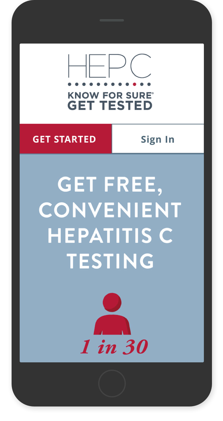
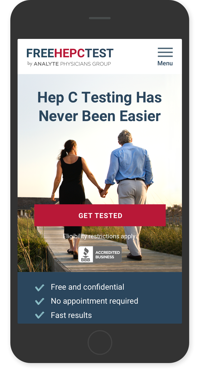
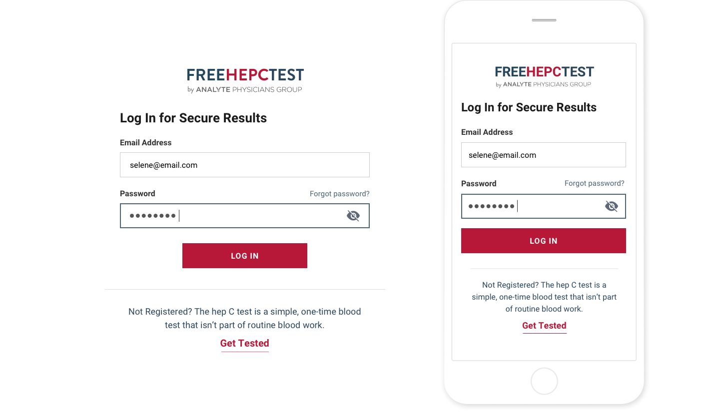
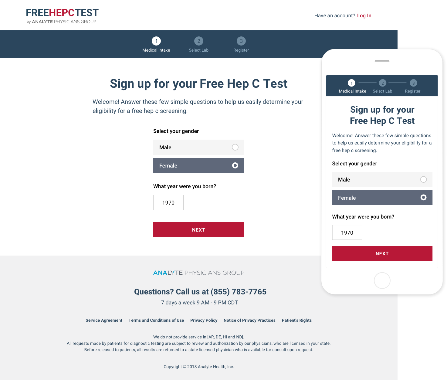
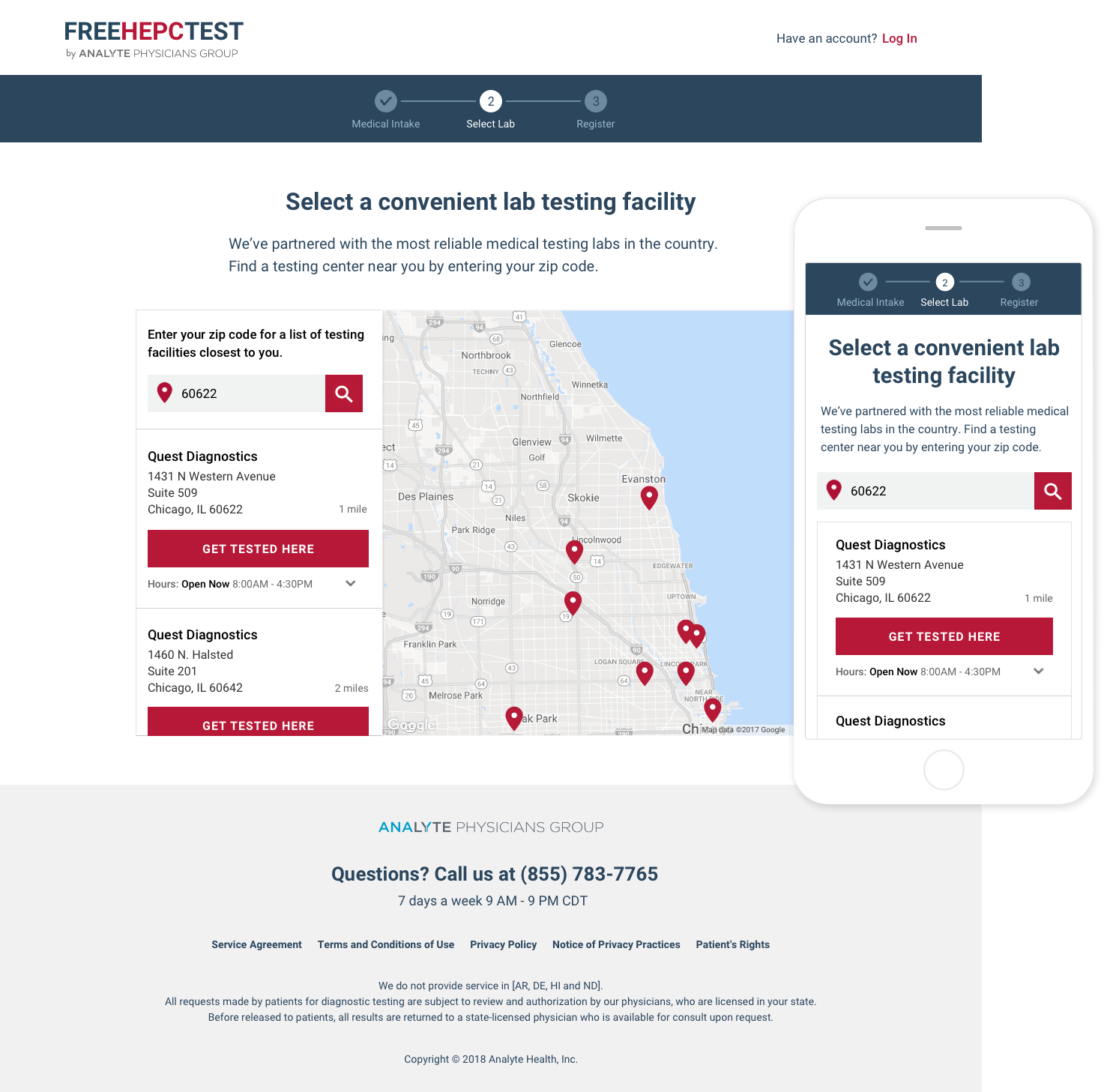
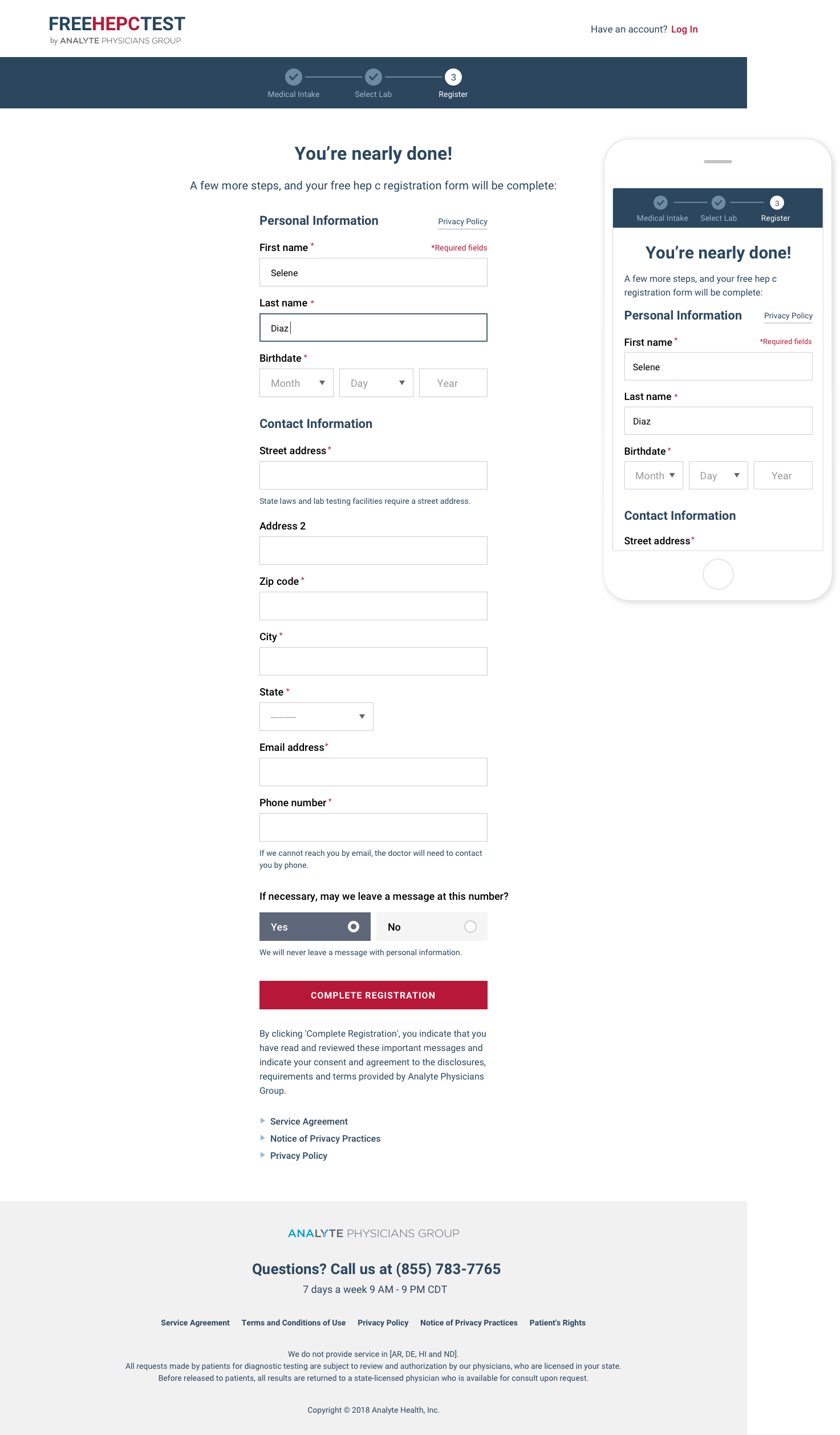
Everyday Health partnered with Hep C Hope to support their Hepatitis C awareness campaign and encourage at-risk populations to schedule a free test. Hepatitis C is 95% curable but without getting tested to know if you have it, you can’t be cured. The Hepatitis C campaign website allows users to create an account, search a nearby lab, schedule a test and view their results. Due to low conversion rates, I stepped in to lead Design and UX and transform the existing website into a seamless, user-centered experience that would increase signups. My design incorporates UX and marketing best practices, an educational content strategy and a modern visual interface that feels credible and trustworthy.

Role

Creative Direction
UX & UI Design
Marketing Design

Project Type

Signup Funnel
Marketing Website

Date

2018

Assessing the existing microsite

The Hepatitis C Testing website consisted of three parts: (1) landing page, (2) signup funnel and (3) login page. The main landing page provides a brief overview of Hepatitis C and how testing works. In the signup funnel users confirm their eligibility, schedule a test at a nearby lab and create an account to access their test results. Weeks after launching, analytics confirmed low engagement and signup rates.

Identifying usability issues

Leveraging my experience in product and designing marketing funnels, I identified critical areas of improvement and banded together with the Head of Product and Head of Sales at Everyday Health to gather additional feedback.
  1. content is below the fold
  2. value prop is unclear
  3. few CTAs (only 2)
  1. feels untrustworthy
  2. poor font legibility
  3. pages feel disjointed

Creating a stronger brand identity

The original logo was missing context and lacking credibility. I redesigned the logo by making it simple, straightforward and bold. To add credibility, I integrated our partner's name into the logo; Analyte Physicians Group is a prestigious group of physicians and specialists. I opted for a horizontal layout in order to reduce the height of the navbar and show more content.
Original Logo
Redesigned Logo

Simplifying the visual language

Less is more. Instead of starting from scratch and redesigning the microsite, I simplified the existing color palette and UI. I reduced number of colors from 20 to 5 and replaced the old font with Roboto, a sans-serif typeface, to revitalize and modernize the interface.

Color Palette: 20 5 essential colors


Font-Family: Roboto

A user-centered and optimized landing page

I redesigned the entire microsite in a week using the updated color palette and new typeface. For the landing page I reshuffled content and prioritized user benefits above the fold, followed by reasons to get tested, how testing works and why you should test with us. I strategically highlighted the CDC's recommendation to get tested for Hepatitis C in order to gain credibility, create urgency and increase signups.

Mobile-first and responsive

Whether viewing the website at home on your laptop or on-the-go on your phone, the design is optimized for all device types and sizes. For the landing page on mobile, I prioritized the signup CTA and signup benefits above the fold to immediately inform users about our services.
Before
After

Scaling UX optimizations to all pages

The original login page and signup flow had several usability issues including lack of navigation back to the homepage and lack of consistent branding and visual cohesion which made users feel disoriented.

Smooth login

I redesigned the login page to reflect the new branding, added navigation back to the homepage, integrated hide/show password feature and moved "Forgot password?" next to password. I also added copy and a link for unregistered users to sign up.

Registration as easy as 1, 2, 3

The original registration flow had 10 steps! I condensed the flow to 3 steps by regrouping sections and renaming them to create a user-friendly signup flow.


Previous

Component Library

Next

Outside|In: Multiple Sclerosis